
In crypto trading, reading and using candlestick charts might be tough for someone who is new to a crypto platform India or investing in cryptocurrency. Certain people believe in their gut impulses and act on them while making investment decisions. In a bull market, this method may work for a short time. But it is unlikely to be successful in the long run.
Many new investors confuse by these charts. This contains a wide range of patterns and is frequently complex. Even simple knowledge of how to read and use candlestick patterns. However, it provides traders with price action information that can help them plan their future moves.
The horizontal axis represents time in candlestick charts, while the vertical axis represents price data. The use of Candlestick in cryptocurrency India trading allows you to view more information than other graph formats, such as bar graphs. In a single glance, you can see the asset’s highest and lowest prices, as well as its starting and closing prices.
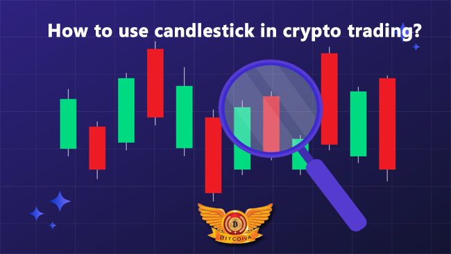
What is Candlestick in Crypto Trading?
One of the most prevalent methods of plotting and evaluating price trends is candlestick charting. Monehisa Homma was invented in the 1700s by a Japanese rice merchant, 100 years before the Western world developed bar and point-and-figure charts.
Homma discovered that, in addition to supply and demand, traders’ emotions had a significant impact on rice prices. Homma’s graph was subsequently developed over the ages, most notably by Charles Dow, one of the field’s founding fathers.
Candlestick charts, so named because of their appearance, are used by traders and investors to aid in crypto currency trading platform decisions based on historical market data, which may provide some historical lessons, such as important price resistance and support levels to be aware of, as well as the potential impact they may have.
With varying hues depending on the extent of the price movement, the candlesticks visually express the traders’ emotions. If you’re a new trader, one of the most critical skills you’ll need to master is reading and analyzing candlestick charts correctly. They may appear intimidating at first, but this article will teach you the fundamentals of what each element in the chart represents and how to read them so you can make the most of previous price data.
When crypto currency trading India, it’s critical to remember that the time frame you’re employing is everything. To offer you a better chance of spotting and promptly responding to patterns generated by Japanese candlesticks, choose a time frame of 1 hour or less for day crypto trading.
A Candlestick’s Anatomy
Body: The body represents the open-to-close range. To put it another way, it depicts the price difference between closing and opening.
Wicks:
These sometimes known as “tails” or “shadows”. During the candlestick period, they display the asset’s peak and lowest price points. When there is no wick to keep track of the opening and closing prices, they are the lowest and highest.
Highest Price
The highest price transacted during the period is represented by the top of the upper wick.
Lowest Price
The lowest price at which the asset is traded is shown at the bottom of the lower wick.
Opening Price
This is the price at which the new candlestick time period’s first trade took place. The candle flashes green when the price increases and red when the price decreases.
Closing Price
During the candle’s formation time, the closing price is the price at which the candle was last traded. If the price is higher than the opening price, the candle will be green. And if it is lower, it will be red.
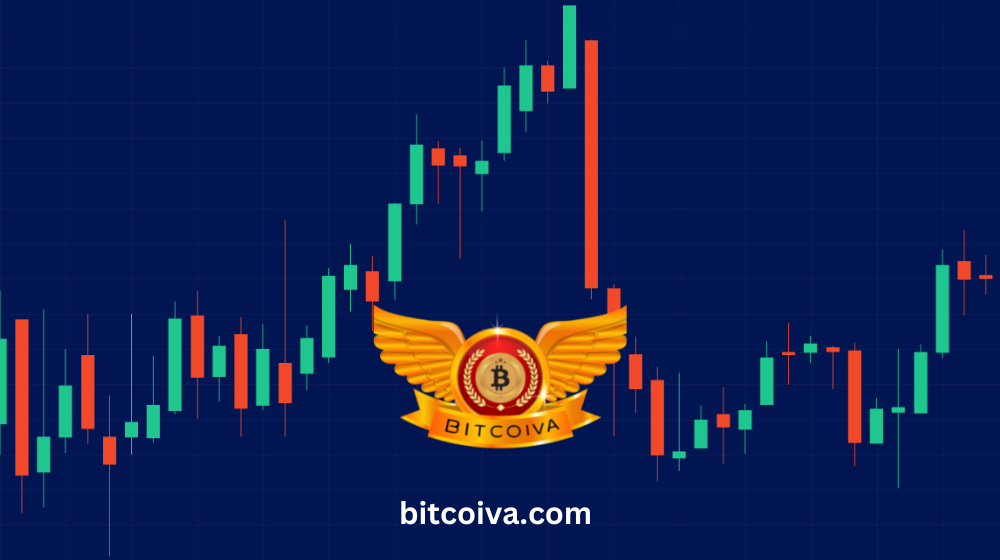
How Do You Read Candlestick Charts?
Candlestick charts have the advantage of reading at a glance. Since they provide a concise picture of price history. Each candlestick on the graph reflects the same timeframe, which could be seconds or decades long.
The longer the body of the candlestick, the more fierce the war between the bulls and bears during that time frame. And if the wick is short, it signifies the high or low price during the measured time frame. If the candlestick’s body is green, it signifies the asset closed higher than it opened. And if it’s red, it suggests the item closed lower than it opened. Some charting tools, on the other hand, will employ black and white instead of red and green, with hollow candlesticks signifying upward movement and solid candlesticks representing downward movement.
Different Types of Candlestick Charts
Single, double, and triple candlestick patterns occur on candlestick charts, each signifying a particular market trend. Traders can use candlesticks of different patterns in their crypto trading.
Use a Single Candlestick Pattern
The other two patterns are based on this one. Single patterns might assist you in detecting market trends from double and triple patterns. There are eight different single candlestick patterns to choose from:
Doji – “Doji” means “same as” in Japanese, and it is formed when the opening and closing prices within a given time frame are similar or almost identical. The candle’s body will be squeezed, and the tail will be highly visible.
Gravestone – There will be a long wick above the body, which resembles a gravestone and signifies bearish conditions.
Inverted gravestone/dragonfly – The tail below the body of an inverted gravestone/dragonfly suggests that the bullish force is waning.
The hammer/hanging man – The hammer/hanging guy has an extremely long wick below the body and a very slight wick above it. The hammer represents the end of a bullish or negative trend. A “hanging man” is a hammer that represents a bullish power.
Inverted hammer/Shooting star – A lengthy upper wick and smaller body characterize the inverted hammer/shooting star, which signifies a reversal trend. A “shooting star” indicates a shift to a bearish market, whereas a “inverted hammer” indicates the reverse.
Spinning top – This pattern appears when there has been very little change in the cryptocurrency market. It symbolizes a short body with wicks that are nearly comparable in length on either side.
Standard line – Candles with long bodies and relatively short tails at either end make up the standard line. This pattern does not provide crucial market signals; rather, it implies that the market has the ability to sustain itself in either a bullish or bearish trend.
Marubozu pattern -The Marubozu pattern characterizes by a body with no tails. It reveals if a bullish or negative trend is developing.
Use Double Candlesticks Pattern
The patterns on the candlesticks read in pairs. The following are the most typical double candlestick patterns:
Bearish/Bullish – Engulfing patterns that suggest a market reversal and show that one trend is swamped by the other in the opposite direction, known as bearish/bullish engulfing. A bullish engulfing pattern will have a bearish candle followed by a bullish candle with a larger body; a bearish engulfing pattern will have a bearish candle followed by a bullish candle with a smaller body.
Tweezers – a reversal in market conditions represents this pattern. Tweezers can be at the top (wicks are underneath) or bottom (wicks are at the top) of both candles, with tweezers at the bottom suggesting a transition from bullish to bearish and vice versa.
Use Triple Candlestick Patterns
These patterns use three candles, as the name implies. Use candlestick pattern that the two most common triple candlestick patterns, both of which indicate a trend reversal, are:
Morning/evening star – the evening star pattern begins with a bullish candle, then a small bullish/bearish star, and finally, a longer bearish candle that is longer than the first bullish candle in the series.
Three soldiers – this design is a three-step staircase. The first candle in a bullish trend is small, and the pattern grows larger, indicating a move from a bearish to a bullish trend, and vice versa, with the alternating pattern.
Heikin-Ashi Candlestick Charts: What Are They?
We’ve already gone through what Japanese candlestick charts are and how to read them. The Heikin-Ashi method, on the other hand, is a different approach of calculating candlesticks. In Japanese, heikin-ashi means “average bar,” hence these charts use average price data. Heikin-ashi can help you notice market trends, price patterns, and prospective reversals more easily than typical Japanese candlestick charts, which don’t tell you what happened between the market open and close or which price occurred first, the high or low one.
This is why some traders find it beneficial to utilise both traditional Japanese candlestick charts and Heikin-Ashi to acquire a more comprehensive picture of the markets.
Green Heikin-Ashin candles with no upper wicks usually signal a strong uptrend, whereas red Heikin-Ashin candles with no upper wicks usually indicate a strong downtrend. Patterns may take longer to develop because this method of price charting employs average price data. Price gaps are also absent from these graphs.
In summary Candlestick charts, as opposed to standard line charts, give a wealth of information and are a fantastic crypto trading tool. When utilised alone, however, they have a number of drawbacks. As a result, they’re usually used with other technical indicators such as the RSI and the Moving Average.
Visit us at: www.bitcoiva.com