

Crypto markets can experience sudden price movements when large amounts of leveraged trading activity are concentrated around specific price levels. Traditional price charts show where Bitcoin (BTC) and Ethereum (ETH) have traded, but they do not always reveal where leveraged positions could be vulnerable to forced closure.
A crypto liquidation heatmap adds another layer to market analysis by estimating where leveraged long and short positions may face liquidation. When combined with open interest, funding rates, volume, and price structure, the heatmap can help traders understand how leverage is distributed across the market.
The important point is that a liquidation zone is not a price prediction. It represents an area of potential leverage-related activity if the market reaches that level.
What Is a Crypto Liquidation Heatmap?
A crypto liquidation heatmap is a visual tool that estimates price levels where leveraged futures positions could be liquidated.
When traders use leverage, they control positions larger than the collateral supporting them. If price moves far enough against a position and margin requirements are no longer met, the exchange can automatically close it.
A heatmap attempts to identify where these liquidations may be concentrated.
Depending on the analytics platform, stronger or brighter areas generally indicate larger estimated liquidation concentrations, while weaker areas indicate less concentrated exposure.
This gives traders a visual way to examine where leverage risk may be building around BTC or ETH.
How to Read Liquidity Zones Above and Below Price
The first step is to identify the asset’s current market price and then examine liquidation concentrations on both sides.
Zones below the current price can represent concentrations of leveraged long positions that may become vulnerable if price declines.
Zones above the current price can represent concentrations of leveraged short positions that may become vulnerable if price rises.
This distinction matters because liquidating longs and shorts can affect the market differently.
When a leveraged long is liquidated, the forced closure can contribute to selling pressure. When a short position is liquidated, closing the position can contribute to buying pressure.
Large concentrations therefore show where forced market activity could potentially intensify an existing move.
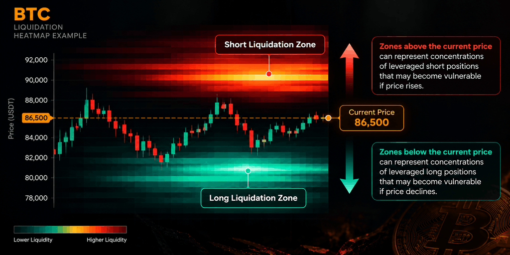
How to Analyze a BTC Liquidation Heatmap
When reading a Bitcoin liquidation heatmap, avoid focusing only on the brightest area.
Instead, consider three variables:
Concentration: How large does the estimated liquidation cluster appear?
Distance: How far is the cluster from Bitcoin’s current price?
Distribution: Are liquidation zones concentrated mainly above price, below price, or on both sides?
The distance between current price and a liquidation zone can also be measured:
Distance to Zone (%) = ((Liquidation Zone − Current Price) ÷ Current Price) × 100
For example, a major cluster located 2% from BTC’s current price has different near-term relevance from a similar cluster 10% away.
This does not mean the closer zone will be reached. It simply provides a more structured way to compare liquidation concentrations.
How to Read an ETH Liquidation Heatmap
Ethereum should be analyzed separately because ETH’s derivatives positioning does not necessarily mirror Bitcoin.
Start by locating the current ETH price. Then examine whether estimated liquidation exposure is concentrated above or below it.
If significant short-liquidation zones appear above ETH, a strong upward move into those areas could force some leveraged shorts to close.
If large long-liquidation concentrations exist below ETH, a decline into those levels could expose leveraged longs to forced closure.
The key analytical question is not “Which zone will ETH hit?”
A better question is:
“Where could forced position closures become significant if ETH moves in that direction?”
That keeps liquidation analysis focused on market structure rather than prediction.
Combine Liquidation Heatmaps With Open Interest
A liquidation heatmap becomes more informative when analyzed alongside open interest (OI).
Open interest represents outstanding derivatives contracts that remain active. Changes in OI can help determine whether leverage is entering or leaving the market.
Four combinations are particularly useful:
Price ↑ + OI ↑: New derivatives exposure is entering as price rises. Leverage may be expanding.
Price ↑ + OI ↓: Price rises while outstanding positions decline. Position closures or short covering may be contributing.
Price ↓ + OI ↑: New derivatives exposure is building during falling prices.
Price ↓ + OI ↓: Existing positions are leaving the market, potentially through voluntary closures or liquidations.
Now combine these signals with the heatmap.
For example, rising OI alongside increasingly dense liquidation clusters may suggest that leverage concentration is growing. Falling OI after a sharp liquidation event can indicate that part of that leverage has been removed.
Add Funding Rates to the Analysis
Funding rates provide another useful layer when analyzing perpetual futures.
Positive funding generally means long-position holders pay short-position holders, while negative funding generally reverses that relationship.
Instead of treating positive or negative funding as an automatic bullish or bearish signal, examine it together with OI and liquidation positioning.
For example:
Rising OI + elevated positive funding + large long-liquidation clusters below price
can indicate growing leveraged-long exposure.
Meanwhile:
Rising OI + negative funding + large short-liquidation clusters above price
can reflect a different positioning environment.
Neither combination predicts the next market direction. It reveals how leverage is structured.
What Is a Liquidation Cascade?
A liquidation cascade occurs when forced position closures contribute to further price movement, which then triggers additional liquidations.
The process can be simplified as:
Price Move → Liquidations → Forced Buying or Selling → Larger Price Move → More Liquidations
During a rapid BTC decline, for example, leveraged longs may begin liquidating. Forced selling can push price lower, potentially reaching another concentration of long-liquidation levels.
The opposite can happen during a rapid rally. Short liquidations can add buying pressure, potentially contributing to a short squeeze.
This is why liquidation data can become particularly relevant during periods of high leverage and volatility.
Liquidation Heatmap vs Support and Resistance
Liquidation zones should not be confused with traditional support and resistance.
Support and resistance generally come from historical price behavior, trading activity, or technical market structure.
Liquidation zones instead estimate where leveraged positions could face forced closure.
The two may sometimes overlap, but they measure different aspects of the market.
A bright heatmap cluster is therefore not automatically support, resistance, or a guaranteed price target.
Final Thoughts
A crypto liquidation heatmap can provide valuable insight into the leverage structure surrounding Bitcoin and Ethereum.
Instead of using the heatmap alone, combine liquidation zones, open interest, funding rates, trading volume, and price action. Together, these metrics can help identify whether leverage is accumulating, declining, or becoming heavily concentrated around particular price areas.
The goal is not to predict exactly where BTC or ETH will trade next.
The more useful question is: Where is leveraged exposure concentrated, and how could forced liquidations affect volatility if price reaches those zones?
That approach turns BTC and ETH liquidation heatmaps from simple visual indicators into more meaningful tools for crypto derivatives analysis.
This article is for educational purposes only and does not constitute financial or investment advice.
Visit: www.bitcoiva.com